
At first glance, science and art may seem like disparate entities that do not have anything in common. A deeper look tells us a different story- both the natural sciences and art ultimately depend on observing the world around us, albeit for different purposes. Various forms of visual media have played a vital role in communicating and elucidating scientific concepts throughout history. Using images and other visual methods to convey scientific information is called scientific illustration. The primary purpose of scientific illustration is to help the target audience better understand scientific concepts- whether they are researchers, students, or the general public. Thus, science illustration is a vital aspect of science communication at all levels. The distinguishing feature of science illustration is the requirement for accuracy and objectivity in depicting the concept as much as possible. So, while scientific illustration is a form of art, it is art with the specific purpose of communicating science. [1] [2]
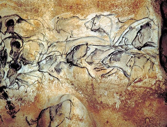
Humans have used art to depict the natural world since prehistoric times. The vast collection of Paleolithic cave paintings depicting animal life found throughout the world is a testament to this ingrained habit. One of the best-preserved examples of Paleolithic natural illustration is the Chauvet cave paintings in Southern France. Most of the paintings in the cave are dated between 33000 and 30000 years ago. Remarkably, the cave entrance was sealed off for over 21000 years due to a rock collapse. A group of hikers accidentally rediscovered it in 1994.
Depicted above is the famous Panel of the Lions at the Chauvet Cave. The cave contains more than 420 such animal paintings. An interesting detail separating these paintings from other Paleolithic cave art is that most of the paintings depict animals that weren’t hunted, such as lions, rhinoceroses, and bears. In contrast, subsequent paintings tended to focus on prey animals, such as deer. Notably, the artists also used sophisticated techniques to create the art, such as scraping the wall in advance to make the art stand out and depicting perspective, which is uncommon in prehistoric cave art. Similar Paleolithic depictions of animals are found in caves throughout the world, from the Bhimbetka Rock Shelters in India (lions and Indian bison) to Ubirr, Australia (paintings of kangaroos). Fascinatingly, a painting from the El Pindal cave in Spain, dated to around 15000 BC, depicts a mammoth with a reddish darkened area right where the heart is supposed to be. Scientists have speculated that the intention of the illustration may be to instruct hunter-gatherers on the location of the mammoth’s heart. If this is the case, the painting may be one of the earliest examples of an anatomical illustration.
Thus, throughout human history, we have used images to communicate information about the natural world. Early humans who relied on hunting and gathering for subsistence shared the same fascination with the world around them that we do and used art to depict the natural world in the best way they could. Modern scientific illustration is, no doubt, very different from these cave paintings, regardless of the sophistication of these works for their time. Inevitably, the tools used to illustrate the natural world have changed over time- from early drawings and engravings to modern digital illustrations, data representation and photographs. This evolution of scientific illustration reflects changes in the technologies available to illustrate science and changes in science itself. As humans discovered agriculture and civilisations arose, our scientific knowledge progressed considerably, and the use of scientific illustrations began to flourish. Images are scarce in ancient scientific manuscripts. If they were indeed present, most of them have likely been lost. However, as both scientific practices and art developed in the medieval era, more scientific drawings became available in scientific texts. As we will see, illustrations began to depict the human body, plant and animal life, and the cosmos. On this note, let’s explore how scientific illustrations have evolved throughout history and learn about the lives of some illustrators who enriched this field with their works. [3] [4]
Leonardo Da Vinci
The study of human anatomy has greatly benefitted from illustrations throughout its history. One of the first well-known anatomists was the Greek physician and philosopher Galen. His works on anatomy were highly influential for over a millennium until they were challenged by later findings, such as the discovery of pulmonary circulation by the Arab polymath Ibn Al-Nafis. Galen’s theories influenced several illustrations of the heart and circulatory system in the 13th century made by scholars in Persia and England. Many of these illustrations may look odd and inaccurate to modern eyes, however, since they often relied on the classical theories of Galen rather than direct observation. As dissections to study human anatomy became increasingly common, there were tremendous advancements in medical illustration.
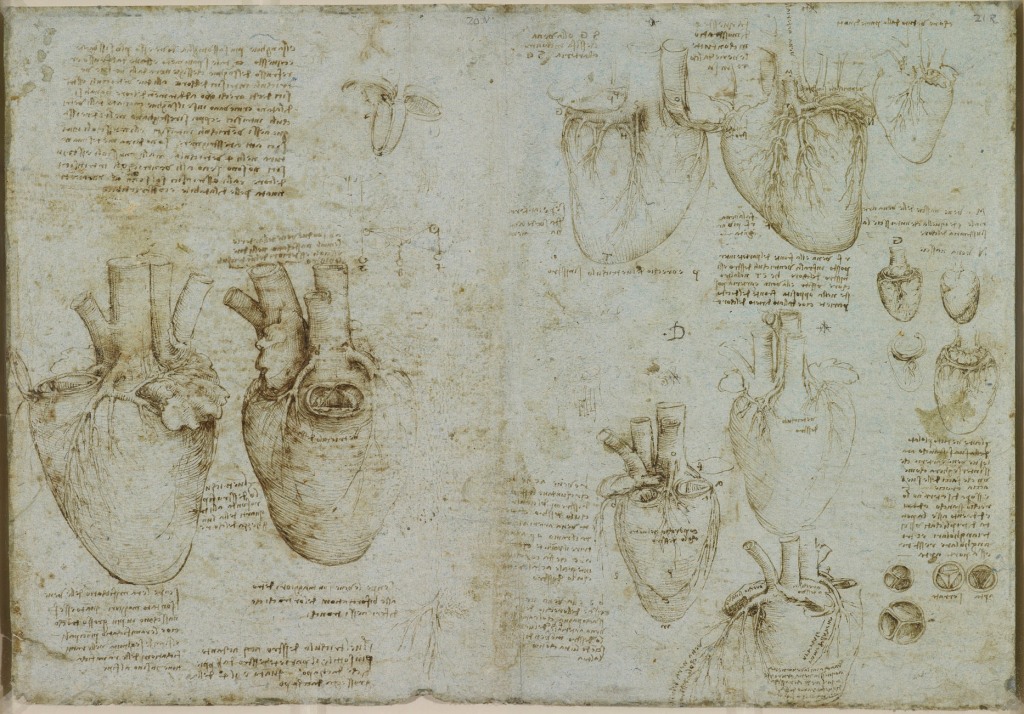
Leonardo Da Vinci drew these illustrations of the human heart (c. 1511-1513). Although Da Vinci is best known for being a painter, he spent much of his prolific career in other pursuits, such as stargazing, architecture, designing weaponry, and scientific studies of human anatomy, botany, and even bird flight. His approach to science was observational: he tried to depict a phenomenon in utmost detail to understand it, rather than focusing on experiments or theoretical explanations. Da Vinci’s most astute scientific insights occurred when he studied the heart’s structure in 1511. He discovered that the heart was four-chambered rather than two-chambered as previously thought, observed the heart’s rotational motion and, most notably, studied how the aortic valve opens and closes such that it only allows blood to flow in one direction.
This well-preserved illustration by da Vinci is now found in the Royal Collection. The illustration’s two largest drawings on the left side depict an ox’s heart, showcasing the key anatomical features in great detail. The diagram above them is a longitudinal section of the heart through each of the two ventricles. Da Vinci thus established that the right ventricle extends to a depth of three-quarters of the length of the heart. The right half of the sheet depicts the structures of the left and right coronary arteries (which supply oxygenated blood to the heart muscles), the branches of the left coronary artery, and the coronary sinus (which collects deoxygenated blood from smaller veins in the walls of the heart). He emphasises the crown-like (Latin- corona) structure of the coronary arteries and coronary sinus around the base of the heart. The drawings on the bottom right also depict the three-cusped (tricuspid) valves of the heart. [5] [6]
Andreas Cellarius
Scientific illustrations have also been instrumental in the study of astronomy. Since ancient times, the geocentric model put forth by ancient scholars such as Ptolemy had been the accepted cosmological model in Europe and the Middle East. However, by the time of the Scientific Revolution in astronomy, several astronomers had questioned this model as it failed to explain the relative motion of several astronomical objects. Copernicus’ heliocentric model (1543) tried to demonstrate that the Sun was the centre of the universe, and the planets revolved around the Sun in circular orbits. In the following century, Johannes Kepler, aided by the observations of Tycho Brahe, introduced elliptical orbits and proposed the laws of planetary motion. The observations of Galileo provided further evidence for heliocentrism. Finally, by deriving Kepler’s laws of planetary motion from his theory of gravitation, Newton removed any final doubts about the validity of the heliocentric model.
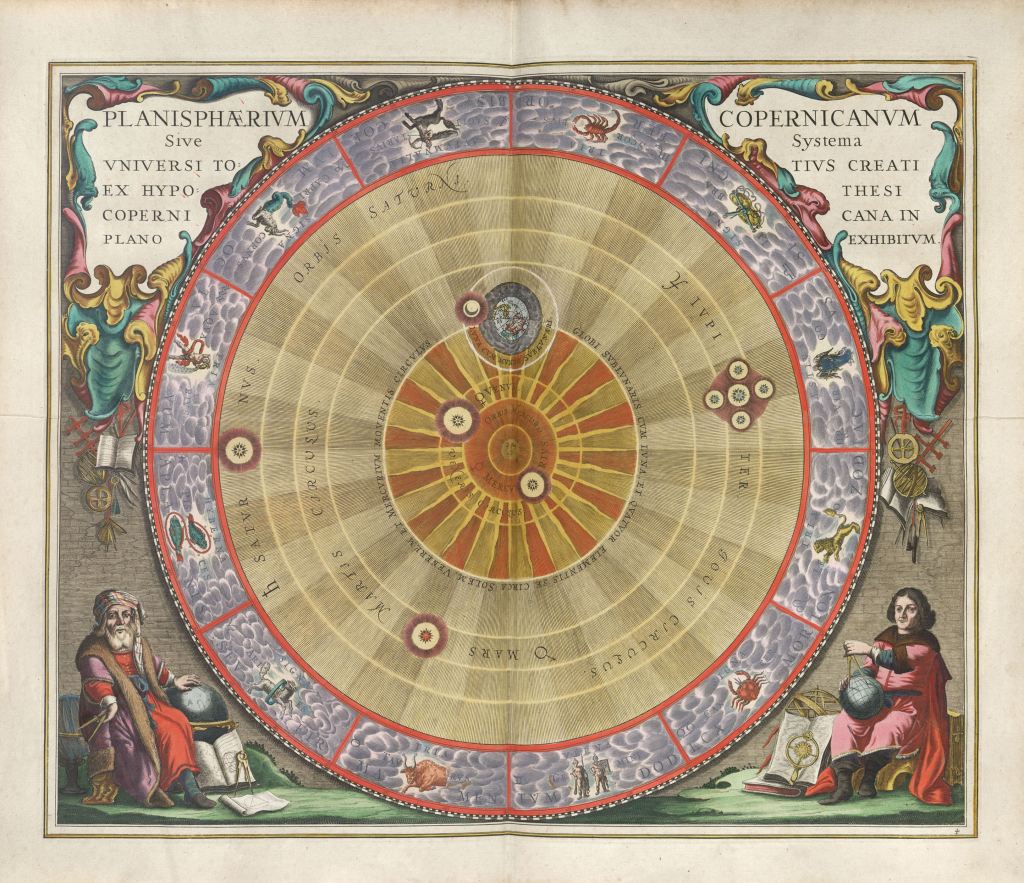
This revolution in astronomy also happened to coincide with the Golden Age of cartography in Renaissance Europe. Gerard Mercator (creator of the ubiquitous but controversial Mercator map projection) wanted to publish an atlas covering all aspects of the known cosmos, geography and history of the earth. Mercator published five volumes of his atlas during his life, the last one being published by his son. After his death, the Dutch cartographer Johannes Janssonius took over the project and published the sixth volume in 1636. In 1660, Dutch cosmographer Andreas Cellarius’ Harmonia Macrocosmica was published as the seventh volume of the project. With the addition of a book describing the world’s cities in 1657, the project was finally complete.
Shown above is an illustration of the heliocentric model from Harmonia Macrocosmica. It depicts the planisphere of Copernicus, or the system of the entire created universe according to the Copernican model, in a planar view. The six known planets appear to revolve around the Sun in circular orbits, as proposed by Copernicus. Earth’s moon and the four known moons of Jupiter at that time- Ganymede, Europa, Io and Callisto are also shown. Cellarius’ atlas contains 29 plates depicting the planetary systems of Ptolemy, Copernicus, and Tycho Brahe, star maps of various constellations, the phases of the moon and its motion, and the motion of multiple planets. Harmonia Macrocosmica is considered a seminal work in celestial cartography and is often regarded as one of the most beautiful celestial atlases ever published. [7] [8]
Maria Sibylla Merian
As we have seen, the Renaissance in Europe greatly popularised the study of the natural world through observations. Scientists and artists used illustrations to represent different aspects of the natural world, from the human body and space to plants and animals. Such observations of plant and animal life were called natural history illustrations, and some of the best-known science illustrators worked in this field. The exploration (and subsequent colonisation) of the Americas and Australia further stimulated these interests. Naturalists from Europe would travel to South America, Australia, and the Galapagos Islands (Darwin’s inspiration for the theory of evolution) to collect and study the local flora and fauna. In the 16th and 17th centuries, there was an increased circulation of illustrations that depicted the newly discovered environment and animals of the ‘New World’, as it was known.
These illustrations of insects are the work of German-born naturalist and science illustrator Maria Sibylla Merian. Like many upper-class European women in the 17th century, she managed a large household and raised a family. But despite that, she managed a successful career as an artist, botanist, naturalist and entomologist. At a time when art was the scientist’s eye, Merian discovered facts about plants and insects that were not previously known. She was the first scientist to study metamorphosis and understand and describe the relationships between animals and their host plants. After many years as a successful artist and writer on plants and insects in Europe, she set sail for the jungles of Suriname with her daughter in 1699. As a result of her trip, she extensively documented tropical plants and insects in her most significant work, Metamorphosis Insectorum Surinamensium.
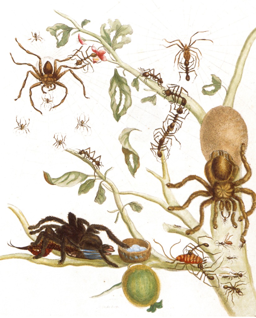
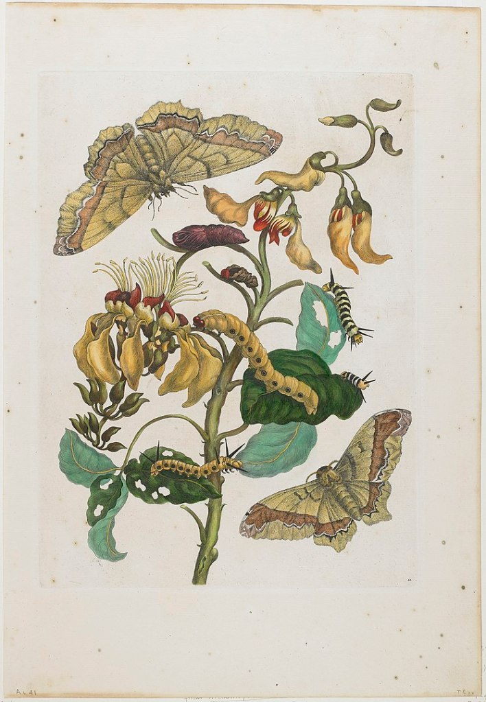
The illustration to the left is a coloured copper engraving from Metamorphosis, “Spiders, ants and hummingbird on a branch of a guava”. The tarantula in the bottom left corner is seen eating a hummingbird. This particular detail of the illustration was criticised and dismissed as impossible during the Victorian era, only to be confirmed later. She also correctly depicts ants building bridges with their bodies. The illustration to the right shows caterpillars, butterflies (Arsenura armida) and flowers (Erythrina fusca) native to Suriname. Her works, especially those depicting tropical fauna and their life cycles, were highly celebrated and considered groundbreaking during her lifetime. But after her death, some scholars thought differently. Her works had been reproduced, sometimes incorrectly. Some of her observations, such as the spider eating a bird, were deemed ‘silly and impossible’. Some of her illustrations did indeed have minor mistakes, such as incorrectly matching some butterflies with their caterpillars, but she was undoubtedly right about the spiders. One possible reason for these errors is that she had to cut short her Suriname trip after falling ill. Modern scholars, however, agree that such small mistakes no more invalidate her contributions than well-known misconceptions occasionally published by other celebrated scientists such as Darwin. As the world has progressed from the sexism of the Victorian era, she is now remembered for being the pioneering woman of science she was, and her contributions to entomology and botany are regarded as groundbreaking. [9] [10]
Elizabeth Gould
As we have seen, natural history illustrations became an essential aspect of observing and studying the natural world from the 16th century onwards. By the 1800s, scientists used illustrations to document all areas of biology, from human anatomy and microscopic studies of cells to botanical and zoological diversity. Some of the best known zoological images of this time are the work of British artist and illustrator Elizabeth Gould.
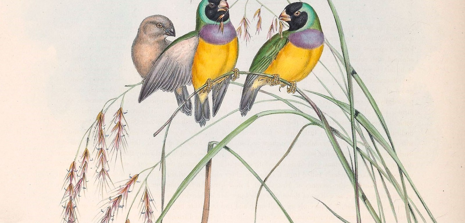
Elizabeth Coxen was born to a middle-class family in Ramsgate, England, in 1804. Having received a formal education in her childhood, she married John Gould, who she met at the Aviary of the Zoological Society at the age of 24. John Gould’s career as an ornithologist was on the rise at this time. When a sample of Himalayan birds came to his desk for preservation in 1830, he decided to publish an illustrated book that documented the diversity of Himalayan birds from the Indian subcontinent. Knowing that his artistic abilities were limited, he gave the task of illustrating the bird collection using the new medium of lithography to Elizabeth. Elizabeth’s name is not mentioned on the title page of the resultant publication, A Century of Birds from the Himalaya Mountains. Her contributions are briefly acknowledged in the preface. Her illustrations were well-received by artists, but John received most of the awards for this work. Subsequently, the couple worked on a 448-plate collection documenting the birds of Europe. Having travelled extensively and observed birds in their natural habitat, Elizabeth recorded the lively interactions between males and females of bird species in her illustrations. She depicted a sense of movement in her artwork.
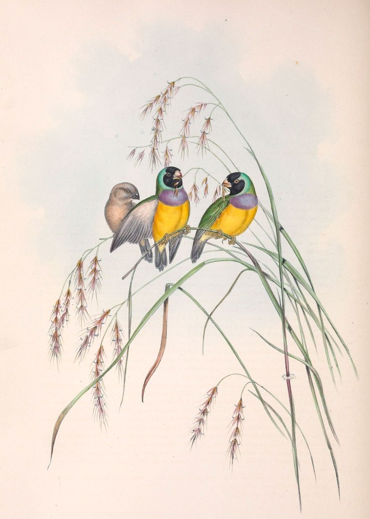
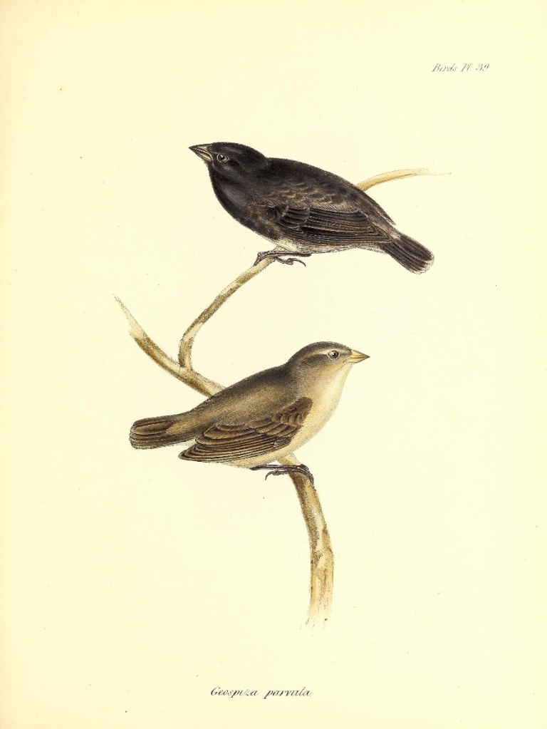
The illustration to the right is from The Zoology of the Voyage of the H.M.S. Beagle. It depicts the now-famous Galapagos finches, which inspired Darwin’s theory of evolution in his 1859 work On the Origin of Species. Elizabeth drew plates to accompany John’s text on the bird specimens brought back by Charles Darwin from the H.M.S. Beagle voyage. Elizabeth’s name is absent from these plates. The illustration on the left is from John and Elizabeth’s most successful work, Birds of Australia. Realising the importance of field observations in ornithology, John arranged for himself and Elizabeth to travel to Australia for two years from 1838-1840. They brought back several sketches and samples from their trip, and Elizabeth had lithographed 84 of her drawings when she tragically passed away from a fever after the birth of her eighth child in 1841. After her passing, John named the colourful finch illustrated here in her honour- Amadina gouldiae. The way he failed to credit Elizabeth for her contributions has been denounced by many in later years. Elizabeth’s records and correspondence do not reveal how she felt about this. However, years after her passing, she is remembered for being one of the most talented natural history illustrators of her time. [11]
Ernst Haeckel
If the 19th century was the golden age of scientific illustration, it truly reached its pinnacle through the works of Ernst Haeckel (1834-1919). Haeckel was a German zoologist who redefined scientific illustrations with his acute focus on nature’s symmetries and organic beauty. His illustrations shaped modern views on scientific illustration. They are still produced in science textbooks today and even influenced 20th-century art and architecture, especially the Art Nouveau movement.
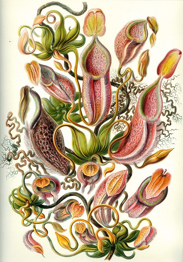
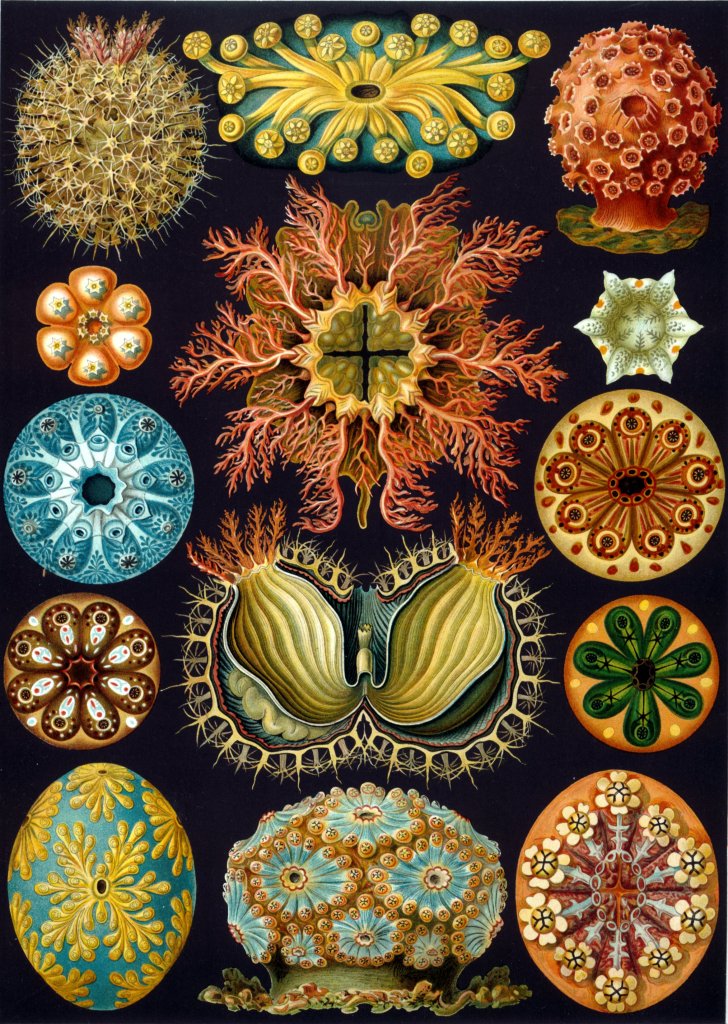
As a zoologist, Haeckel is best known for being one of the strongest proponents of Darwin’s theory of evolution at a time when biologists did not universally accept it. He is also known for his controversial recapitulation theory, best summarised by the statement ‘ontogeny recapitulates phylogeny’. This theory claimed that an individual organism’s biological development (ontogeny) parallels the entire evolutionary development of its species (phylogeny) and has now been discredited in its unmodified form. He also extensively studied invertebrates, particularly protozoa called radiolarians. He also proposed a system of classifying living organisms into three kingdoms based on their evolutionary history and discovered many new species in the kingdom he named ‘Protista’. Many now-ubiquitous terms in biology, such as phylum, phylogeny and ecology, are credited to Haeckel. He was deeply interested in the development of nonrandom form through evolution, which led to his magnum opus Kunstformen der Natur (Art Forms of Nature), a collection of one hundred detailed coloured plates that illustrated different life forms.
The illustration to the left depicts different tropical pitcher plants belonging to the family Nepenthaceae. Botanical interest in these tropical pitcher plants, and their carnivorous nature to obtain nitrogen and phosphorus for growth, was very high in the 19th century. The illustration to the right, ‘Ascidiae’, depicts different species belonging to the class Ascidiacea, also known as tunicates or sea squirts. They are invertebrate marine filter feeders. From these works, we can see his admiration for the geometry and design of nature. His works brought together art and science to make his discoveries accessible to the public. They created great public interest in various life forms and the otherwise relatively dry field of taxonomy. Some of his drawings have been deemed forgeries for failing to adhere to the rigour of scientific evidence; they also reflect Haeckel’s considerable ability to view nature with an artist’s eye for symmetry and form. In subsequent decades, the rise of photography, especially macro photography, helped depict organisms such as protozoa Haeckel illustrated in a more realistic light. However, Haeckel’s illustrations attempt to communicate information about microscopic organisms’ internal structure and geometry rather than focusing on a more realistic view. Nevertheless, the legacy of Hackel and his illustrations are still prominent in both biology and art today. [12] [13]
Santiago Ramón y Cajal
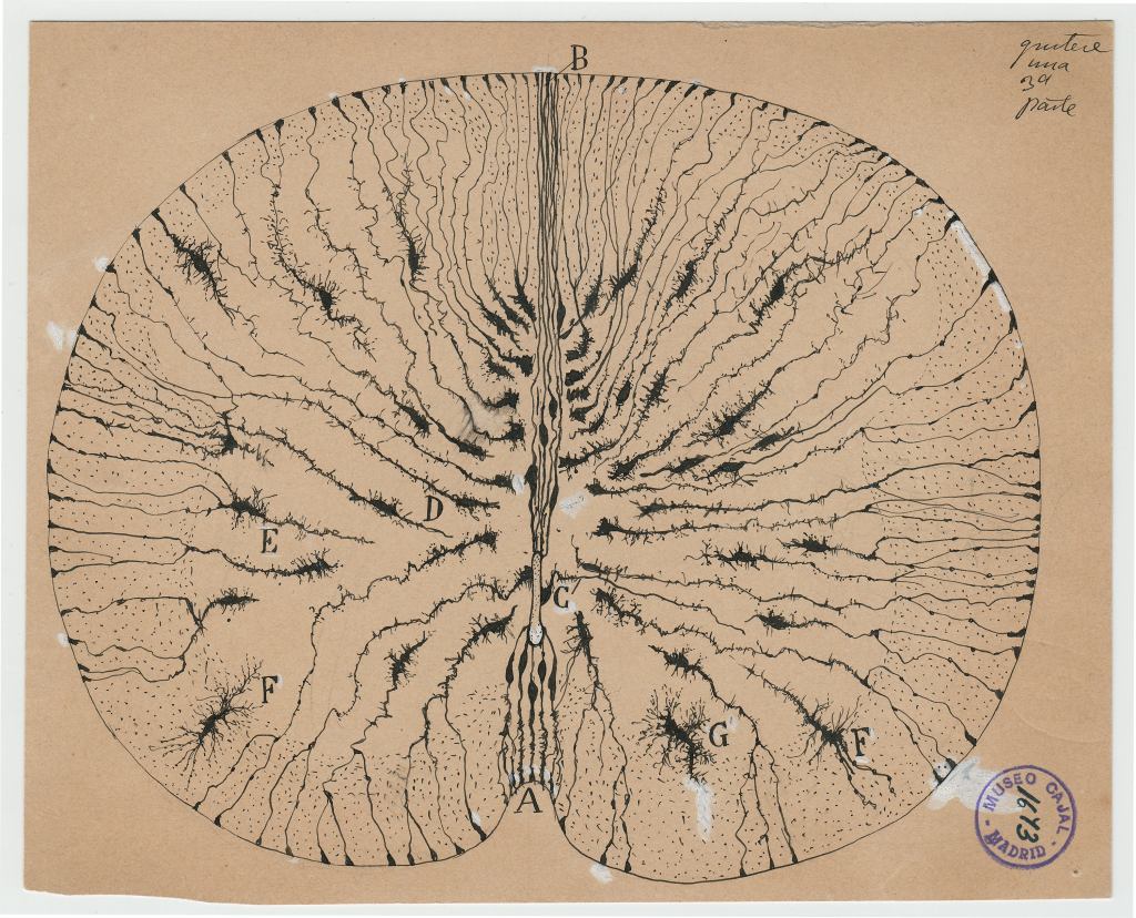
These intricate pen sketches are the work of the Nobel Prize-winning biologist and father of neuroscience, Santiago Ramón y Cajal. Before the advent of micrographs, scientific illustrations were the only way to depict biological structures observed under a microscope. Prominent 17th-century scientists who adapted the microscope, such as Robert Hooke (the first scientist to observe microbes) and Antonie van Leeuwenhoek (the father of microbiology), were well-known for their illustrations. However, the beauty and complexity of microscopic illustrations reached their zenith in the early 20th century through the works of Cajal. The artworks of Cajal also highlight the role of scientific illustrations in proving scientific concepts.
Born in 1852 in Navarre, Spain, Santiago Ramón y Cajal was a rebellious and artistic child. Interestingly, he was imprisoned at the age of eleven for destroying his neighbour’s gate with a homemade cannon! He enrolled in medical school to comply with his father’s wishes despite his passion for art. Later, he discovered an interest in studying tissues, which enabled him to apply his artistic skills to his research. His artistic eye immensely helped his scientific pursuits. When examining brain tissue under a microscope, where others saw a complex jungle of wires, Cajal could document individual cells and the intricate patterns they formed in neural tissues. He made thin slices from brain tissue and used silver nitrate to prepare them for observation, similar to how photographs were captured on plates. Armed with a relatively simple microscope, some ink and a piece of paper, he spent much of his five-decade career studying and illustrating neurons and their structure. As a result, he is credited for discovering the neuron doctrine, the concept that our brains and nervous system are made of a discrete network of contiguous cells called neurons rather than a continuous network of wiring. This idea was controversial during his lifetime, but it ultimately became the foundation of modern neuroscience after synapses were observed through electron microscopy.
The illustration to the left depicts glial cells in the mouse spinal cord. Glial cells are an abundant class of cells in the central nervous system that do not produce electrical impulses. Their functions were not well-understood at that time. Cajal’s brother Pedro, also a scientist, theorised that they were ‘support cells’ that insulated neuronal electrical activity, to which Cajal agreed. Insulation is indeed one of their primary functions, along with supporting neurons, supplying them with nutrients and oxygen, and removing pathogens from the nervous system.
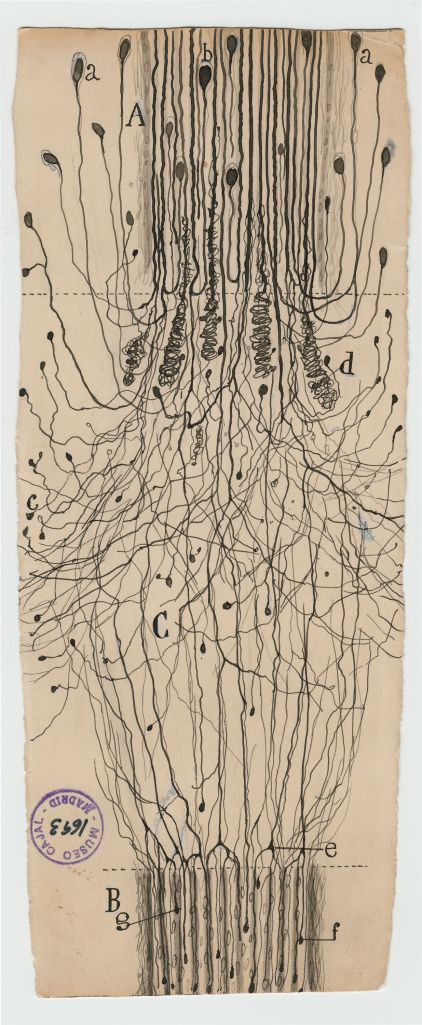
The second illustration shows a cut nerve outside the spinal cord. It highlights how Cajal meticulously illustrated the beauty and detail of neural structures. He depicted each neuron as a discrete cell while highlighting neurons’ complex anatomical structures when they came together. These illustrations and innumerable others are the legacies Cajal left behind after his death in 1934. His works continue to be subjects of fascination and wonder among neuroscientists and artists alike. They are a powerful reminder of how scientific illustration has served as the mind’s eye for scientists and how it forms a pioneering scientific force. [14] [15] [16]
Mary Louise Baker
By the early 20th century, photography had become widespread, and photographs permeated every area of scientific research. One key advantage of photography was what scientists of that era called ‘mechanical objectivity’- photos could be trusted to realistically capture the world in a way the eye could not. Indeed, many photographs changed science forever, such as ‘Photograph 51’, which showed the diffraction pattern of DNA, taken by Rosalind Franklin. This photograph led to the discovery of the structure of DNA. Does this mean that traditional illustrations faded into obsolescence? Certainly not! Illustrations were still essential to depict things photography could not capture, such as cell organelles and molecules. Drawings could simplify images, make them more understandable, and highlight key features in a way photographs couldn’t. Illustrations were also essential for depicting damaged artefacts as they had been in the past, through the imagination of artists. These reconstructions were vital for fields such as archaeology.
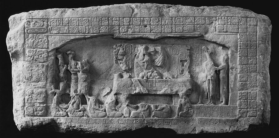
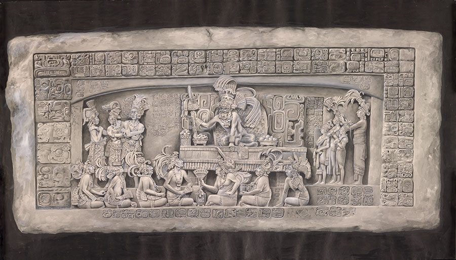
Mary Louise Baker (1872-1962) was one of the most prolific archaeological illustrators of the 20th century. She worked as an artist at the Penn Museum in Philadelphia for 28 years and travelled to places such as Central America and the Middle East on research expeditions at a time when very few women did so. Baker used a diverse range of media- from sketching to watercolour to depict Mayan, Chinese, Egyptian, Nubian and Greek artefacts. Apart from illustrating artefacts, she also worked on making detailed replicas of ancient monuments. One of her most significant projects at Penn Museum was reproducing a to-scale model of the Pharoah Merenptah’s throne room, excavated at Memphis, Egypt. Her beautifully coloured depiction of the throne room is still displayed at the museum.
Depicted above is the original photograph and Baker’s watercolour restoration of the Mayan sculpture Lintel 3, found in Piedras Negras, Guatemala. Lintel 3 is one of the finest remaining specimens of Mayan sculpture ever discovered. This artwork is often considered Baker’s magnum opus, and it was her final work before her long-standing health issues and deteriorating eyesight forced her to retire in 1936. Her eye for detail and expertise as an illustrator is spectacularly depicted in her restoration of this masterpiece. She reconstructed the severely eroded sculpture down to the most delicate details while preserving its original characteristics and style. The courage and determination Mary Louise Baker displayed for her artistic pursuits throughout her life, despite many hurdles, is as vital a part of her legacy as her artworks themselves. [17]
Chesley Bonestell
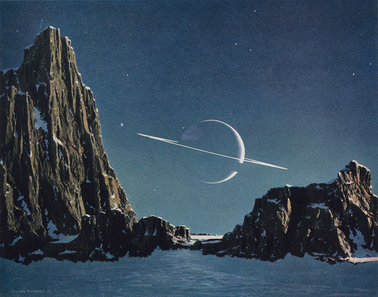
So far, we have seen how illustrations have contributed to scientific research in numerous fields. However, we have overlooked the crucial role of illustrations in science communication and in popularising science among the general public. The 20th century was a revolutionary time for human scientific advancements, and space exploration was one of our most significant achievements during this time. Today, spacecraft and telescopes have extensively photographed every planet, numerous moons, and even asteroids and comets. However, long before we sent rovers to Mars and obtained detailed images of Saturn’s rings, and even before we sent the first satellite into space, illustrators had ideas about the sceneries we might find in these distant worlds. These illustrations, also known as space art, widely popularised space exploration, and one of their pioneers was Chesley Bonestell.
Bonestell was born in 1888 in San Francisco, California. Upon training as an architect, he helped rebuild his hometown after the devastating 1906 earthquake. He was also involved in designing prominent architectural marvels such as the Chrysler Building in New York and the Golden Gate Bridge. He later found himself in Los Angeles, where he painted backgrounds for Hollywood blockbusters such as Citizen Kane (1941). He channelled his lifelong fascination with astronomy into paintings for early sci-fi movies, such as the 1953 adaptation of HG Wells’ “The War of the Worlds”. Around this time, Bonestell’s paintings frequently began to appear in popular magazines such as Life. His scientific illustrations were brought to wider public attention when he collaborated with prominent science writer Willey Ley. The resultant book, The Conquest of Space, attempted to illustrate the human future in space. This work was particularly influential at a time when the United States, and its arch-rival, the USSR, were taking their first steps towards a space program, and public interest in space exploration was booming. Bonestell’s paintings stood out for showing planetary surfaces and rockets in space and humans in space suits back when we didn’t know much about either of these.
One of Bonestell’s seminal works- Saturn as seen from Titan, is shown above. It was first painted in 1944 for Life and later published in The Conquest of Space. This work, along with numerous others Bonestell published in the 1950s and 1960s, would go on to inspire a generation of scientists to wonder about the mysteries of worlds beyond our own, including Carl Sagan and numerous others. His works also shaped the future of space art as a field. Artists such as Don Davis, who worked on Sagan’s 1980 television series Cosmos, and Douglas Trumbull, who created the special effects for 2001: A Space Odyssey in 1968, were all inspired by the works of Bonestell. Interestingly, when asked what he thought about the Apollo 11 moon landing in 1969, Bonestell was disappointed that the moon’s surface didn’t look as he had imagined. However, many of his other paintings, especially those of Jupiter and Saturn seen from orbit, were accurate and closely matched photos from later NASA missions. Thus, even after he died in 1986, the legacy of Bonestell’s works continues to inspire generations of future scientists and makes even those who aren’t scientists wonder about what lies beyond our little blue planet. [18] [19]
Scientific Illustration in the Modern Era

Our journey through the history and evolution of scientific illustration finally brings us to the modern era. So, is scientific illustration still relevant to modern science? Certainly! Science remains a visual endeavour, as it has been throughout its history. The only difference is that scientists and science communicators have a wide variety of tools at their disposal to visualise scientific concepts today, which they lacked in the past. Whereas drawings were the only way to visualise science 200 years ago, there are a multitude of possible media today- photography, software to generate illustrations and graphics, as well as hand-drawn physical and digital art. So, even in this diverse and digitised landscape, illustrations continue to play an essential role in communicating science, even as the tools used to create these illustrations have evolved.
Today, the various visualisation tools in a scientist’s arsenal complement each other, each serving a different purpose and contributing to communicating science. Photographs at macroscopic and microscopic scales and images generated from scientific data are essential for scientific practice since they provide objectivity and depict things as they are. However, illustrations also have the power to coarse-grain details that obstruct the bigger picture from view. Case in point, biophysicist Jane Richardson’s use of ribbons and arrows forty years ago prevails as the dominant mode of representing the 3D structures of proteins, as opposed to viewing all of the atoms at once. Illustrations simplify complex systems to help audiences understand scientific concepts, as they do in textbooks and scientific journals. Most importantly, the beauty and creativity of illustrations draws audiences of all levels to scientific texts and makes science accessible to a larger audience.
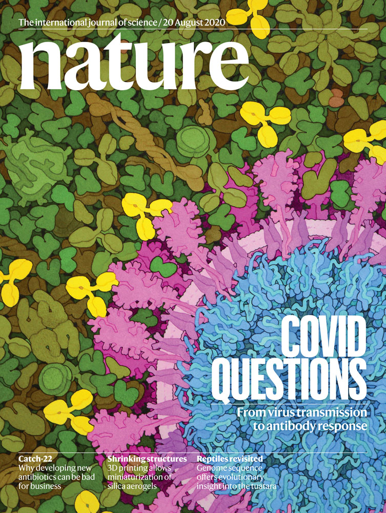
Shown above are the cover pages of two prominent journals- Nature and Science. Illustrations such as these are frequently found in academic journals and magazines. The image to the left is a painting by artist and molecular biologist David S. Goodsell. It is an artistic impression of SARS-CoV-2 in the bloodstream based on electron microscopic images of the virus. Neutralising antibodies, depicted in yellow, are shown attached to the viral spike protein. The second illustration is a data visualisation by illustrator Valerie Altounian. It shows ions escaping the atmosphere of Mars due to solar wind radiation. Their colour depicts the energy of escaping particles, and the most energetic ions create a white plume. This impactful illustration was made using Python and Cinema 4D, highlighting the diversity of tools used by illustrators today. [20] [21] [22] [23]
– Soumyadev Paul

Very good and very well documented article.
Silently an artistic illustration speaks a lot about the origin of that particular piece for farther scientific inventions! Author has beautifully bridged a 200 years old skill to the modern scientific inventions! It’s a strong weapon indeed!
Well composed text and very rich and rare illustrations.
Very well written and researched . Well done gudda.
Sorry, it took me nearly a week to read it through.And I have gone over twice.
Enreaching and engrossing.
The author,with his indepth studies,while penning this article……that is more of a synopsis of a Research paper itself….,will make IISER proud of you.